
How to Read Market Strength Like a Pro
If you want to know how to read market strength the way professional traders do, you need more than a gut feeling about whether the market “feels” bullish or bearish. You need a repeatable process built around a handful of core indicators: volume, price action, momentum, and market breadth. Put those together, and you stop guessing about the health of a trend and start reading it with real evidence.
This is the same framework we walk through with new traders again and again, because it works on any stock, any sector, and any index. Once you understand how these pieces fit together, you'll start to see not just whether the broad market is healthy, but whether an individual stock is gaining momentum or quietly losing it inside its own trend.
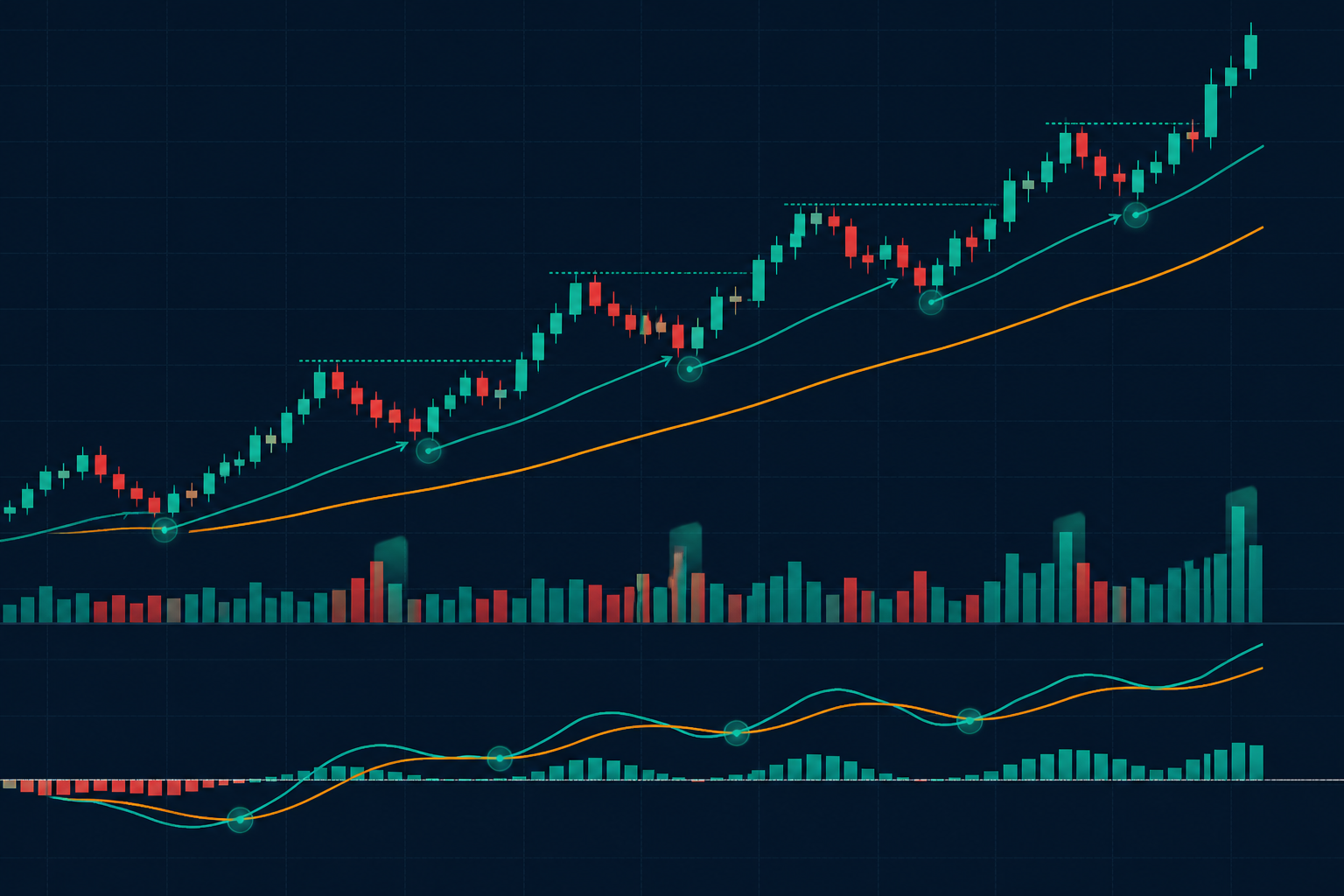
Candlestick chart showing higher highs and higher lows with a MACD momentum indicator confirming an uptrend
How to Read Market Strength: Start With the Signs of a Healthy Uptrend
A bullish trend leaves a specific footprint. Price should be printing a clear pattern of higher highs and higher lows, and that structure should be backed by increasing volume on the up moves. Momentum indicators like the MACD (moving average convergence divergence) should agree with price, and the stock should be holding above its key moving averages. When all of that lines up, you're looking at confirmation, not just a hunch.
That agreement between price and momentum is called convergence. If price is making a new high and your momentum indicator is making a new high right along with it, the trend has real fuel behind it. This is the baseline picture you want to see before you get comfortable holding a long position.
"That agreement between price and momentum is called convergence."
Learn to Spot the Warning Signs Early
Trends don't reverse overnight. They usually give you clues first, and those clues show up in the same indicators you already used to confirm strength. Watch for lower highs and lower lows starting to creep in, along with rising volume on down days instead of up days. Pay close attention to MACD divergence, which is when price pushes to a new high but momentum fails to confirm it with a new high of its own.
That combination, a divergence on momentum, an expanded range candle against the trend, and heavier volume on the down move, is one of the clearest warnings that an uptrend is running out of gas. It doesn't guarantee a reversal, but it tells you the balance of power is shifting, and it's time to tighten your risk management. Once a prior swing low gets taken out, you can consider the short-term trend broken, and traders often start looking for rallies back into resistance as opportunities to position to the downside.
"It doesn't guarantee a reversal, but it tells you the balance of power is shifting, and it's time to tighten your risk management."
Use Relative Strength to Find Real Leadership
Reading the overall market is only half the picture. You also need to know how an individual stock is performing relative to its sector, and how that sector is performing relative to the broader market. The most common benchmark for this is the S&P 500. Comparing a stock or sector against that benchmark tells you whether you're looking at genuine outperformance or just a stock getting pulled along by a rising tide.
This kind of relative strength analysis is close to how proprietary trading firms approach stock selection every single day, because it filters out noise and focuses capital on the names actually leading the move. Sector rotation takes this a step further by tracking where money is flowing from one sector to the next, which tells you a lot about market sentiment. In a risk on environment, money tends to flow into financials, technology, and consumer discretionary names. When sentiment shifts to risk off, you'll typically see money rotate into utilities, real estate, consumer staples, and healthcare instead.
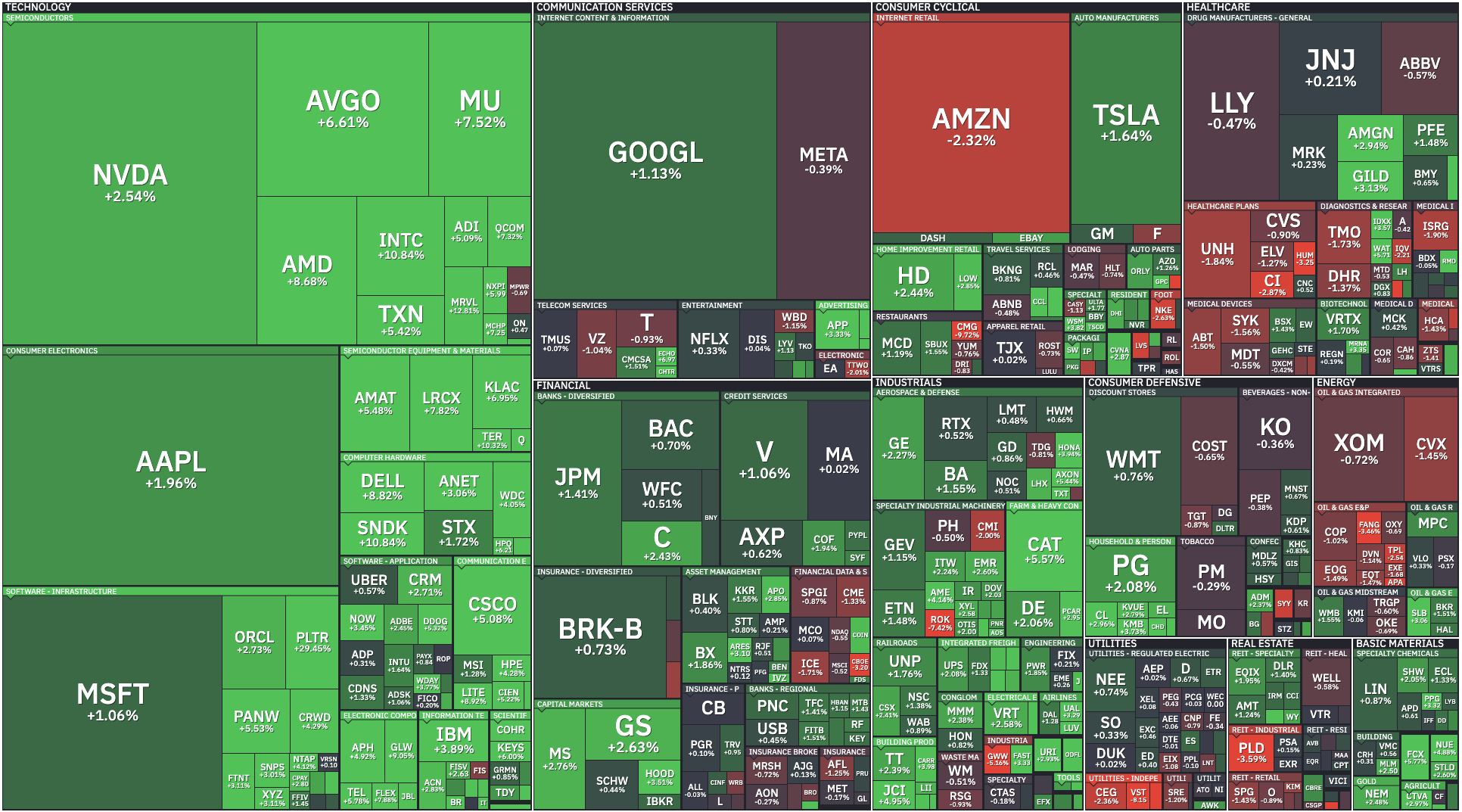
Market breadth heat map with advancing and declining stocks color coded across sectors
Watch Market Breadth, Not Just the Index Price
One of the most overlooked pieces of reading market strength is breadth. The major indexes can look fine on the surface while the internals are quietly falling apart. Start by checking the advancers versus decliners for the day. In a genuinely healthy uptrend, you expect to see a majority of stocks advancing. If you're seeing something closer to forty five percent advancing and fifty percent declining, that's a divergence worth paying attention to, even if the index itself closed higher.
Another breadth metric worth tracking daily is the percentage of stocks trading above their fifty period moving average. Swing traders lean on this one heavily, while longer term position traders often prefer the two hundred period moving average instead. In a strong, broad bull market, you should see a healthy majority of stocks trading above that 50-period moving average, generally north of 55%. When a rally is narrow, meaning it's being carried by only one or two industry groups like semiconductors or software, that percentage tends to run lower even while the index keeps climbing. That's a sign the rally has less support underneath it than the headline number suggests.
Bringing It All Together on the Chart
Here's how this plays out in practice. Say a stock has been trading sideways, and a shorter moving average starts crossing above a longer one just as the stock breaks out to a new high. If the MACD is also crossing above the zero line, that tells you the bulls have taken control. From there, price keeps printing higher highs and higher lows while momentum agrees, which is your green light to stay in the position and let it run toward the next area of resistance.
As price approaches that resistance level, start watching for momentum divergence again. If the stock pulls back to a rising moving average and then pushes to a slightly higher high while momentum fails to make a new high alongside it, that's your cue to start thinking about taking profits rather than assuming the breakout will continue automatically. Sometimes the stock will consolidate and eventually break through on renewed volume anyway. Other times that divergence is the first sign the move is done. Neither outcome is guaranteed, which is exactly why this process is about probabilities and risk management, not certainty.
Eventually, if the stock takes out a prior swing low and the MACD crosses below the zero line, the bears have taken control, and the trend has flipped. At that point, you shift your mindset entirely, looking for rallies into resistance as potential shorting opportunities instead of dips as buying opportunities.
Why This Process Matters More Than Any Single Signal
No single indicator, not volume, not MACD, not breadth, is a perfect predictor on its own. What makes this approach powerful is layering them together so you're reading confirmation and divergence across multiple signals at once. That's also why position sizing and capital allocation matter just as much as the analysis itself. Even a well read chart can go against you, and how much capital you commit to any one idea determines how much a wrong read actually costs you.
"No single indicator, not volume, not MACD, not breadth, is a perfect predictor on its own."
Learning to read market strength is a skill that improves with repetition. The more charts you study using this same lens of price, volume, momentum, and breadth, the faster you'll start recognizing these patterns in real time instead of after the fact. Pair that skill with a disciplined approach to how professional traders manage risk, and you have the foundation that separates traders who last from traders who don't.
This is where trading within a structured environment can start to make a difference over time.